Creating and Animating Custom Buttons in Flutter
Buttons are an essential part of any user interface, and Flutter provides a flexible framework to create custom buttons with various animations. In this tutorial, we'll explore how to install the Lottie library, find animations, and implement an animated button using Flutter.
Prerequisites
Before we begin, make sure you have Flutter installed on your system. You can follow the official Flutter installation guide here.
Creating a New Flutter Project
Before we can dive into creating and animating custom buttons, let's set up a new Flutter project. Follow these steps to create a fresh Flutter project:
- Open your preferred terminal or command prompt.
- Choose a suitable location for your project and navigate to that directory using the
cdcommand. For example,cd Documents/Projects. - Run the following command to create a new Flutter project:
flutter create animated_button_projectReplace animated_button_project with the desired name for your project.
- Once the project creation is complete, navigate into the project directory using:
cd animated_button_project- Open your code editor and open the newly created project folder.
Installing the Lottie Library
The Lottie library allows us to use After Effects animations in Flutter. To install it, follow these steps:
- Open your
pubspec.yamlfile located at the root of your Flutter project. - Add the following line under the
dependenciessection:
dependencies:
lottie: ^2.4.0- Save the file and run the command
flutter pub getin your terminal to fetch the Lottie library.
Now that we have the Lottie library installed, we can proceed to find animations for our custom button.
Finding Lottie Animations
Lottie animations can be found on the website LottieFiles. This website offers a wide range of pre-built animations that can be used in your Flutter applications.
- Visit LottieFiles.
- Browse through the available animations or use the search feature to find a suitable animation for your button.
- Once you find an animation you like, click on it to open the animation details page.
- On the animation details page, click the "Download" button to save the animation JSON file to your computer.
Now that we have the Lottie animation file, let's implement the custom animated button in Flutter.
Adding Lottie Animation to the Project
Once you have found a suitable Lottie animation for your custom button, it's time to add it to your Flutter project. Follow these steps to integrate the animation:
- Create a new folder called
assetsin the root of your Flutter project if it doesn't already exist. - Copy the downloaded Lottie animation JSON file into the
assetsfolder. Let's assume the file name isloading_animation.json.
Next, we need to update the pubspec.yaml file to include the animation as an asset:
- Open the
pubspec.yamlfile located at the root of your Flutter project. - Add the following lines under the
fluttersection:
flutter:
  assets:
    - assets/loading_animation.json
Let’s as well create a custom LoadingAnimation widget for reusability and to make our code a bit cleaner.
import 'package:flutter/widgets.dart';
import 'package:lottie/lottie.dart';
class LoadingAnimation extends StatelessWidget {
final double width;
final double height;
const LoadingAnimation({
required this.width,
required this.height,
});
Widget build(BuildContext context) {
return Lottie.asset(
'assets/loading_animation.json',
width: width,
height: height,
fit: BoxFit.fill,
);
}
}Implementing the Animated Button
Now that we have all pieces in place let’s create our custom button with loading animation.
import 'package:flutter/material.dart';
import 'loading_animation.dart';
class LoadingButton extends StatefulWidget {
final String title;
final bool isDisabled;
final bool isLoading;
final void Function() onPressed;
const LoadingButton({
required this.title,
this.isDisabled = false,
this.isLoading = false,
required this.onPressed,
});
State<LoadingButton> createState() => _LoadingButtonState();
}
class _LoadingButtonState extends State<LoadingButton> {
Color _color = Colors.black87;
Widget build(BuildContext context) {
return GestureDetector(
onTapDown: (_) {
_setClicked(true);
},
onTapUp: (_) {
_setClicked(false);
},
onTapCancel: () {
_setClicked(false);
},
onTap: widget.isDisabled || widget.isLoading ? null : widget.onPressed,
child: AnimatedContainer(
height: 46,
width: double.infinity,
duration: const Duration(milliseconds: 100),
curve: Curves.linear,
decoration: BoxDecoration(
color: widget.isDisabled || widget.isLoading ? Colors.black54 : _color,
borderRadius: const BorderRadius.all(Radius.circular(10)),
),
child: Center(
child: _title(),
),
),
);
}
Widget _title() {
if (widget.isLoading) {
return const LoadingAnimation(width: 50, height: 50);
}
return Text(
widget.title,
style: const TextStyle(
fontWeight: FontWeight.bold,
color: Colors.white,
),
);
}
void _setClicked(bool clicked) {
setState(() {
if (clicked) {
_color = Colors.black54;
} else {
_color = Colors.black87;
}
});
}
}In the above code snippet, we create a new Flutter widget called LoadingButton. This widget uses the GestureDetector to handle different button interactions like tapping down and releasing.
The onTapDown, onTapUp, and onTapCancel callbacks update the button's state to animate the pressed and released states, respectively.
Inside the GestureDetector callbacks, we set the color of our button and AnimatedContainer animates color changes which creates smooth pressed color transitions.
Finally, in the MyApp, we wrap the LoadingButton with a Center widget and display it in the app's main Scaffold.
import 'loading_button.dart';
import 'package:flutter/material.dart';
void main() {
runApp(const MyApp());
}
class MyApp extends StatelessWidget {
const MyApp({super.key});
Widget build(BuildContext context) {
return const MaterialApp(
title: 'Flutter Demo',
home: MyHomePage(),
);
}
}
class MyHomePage extends StatefulWidget {
const MyHomePage();
State<MyHomePage> createState() => _MyHomePageState();
}
class _MyHomePageState extends State<MyHomePage> {
bool isLoading = false;
Widget build(BuildContext context) {
return Scaffold(
body: Center(
child: Container(
padding: const EdgeInsets.only(left: 20, right: 20),
child: AppButton(
title: 'Press me',
isLoading: isLoading,
onPressed: () {
setState(() {
isLoading = !isLoading;
});
},
),
),
),
);
}
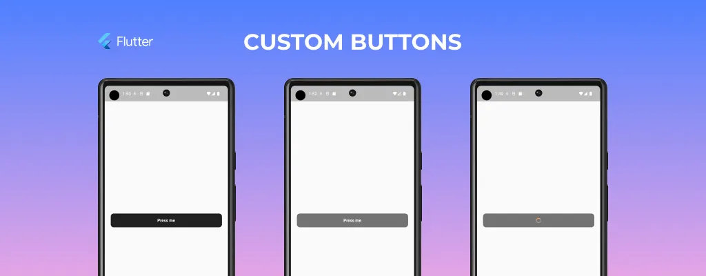
}That's it! You've successfully created an animated button using the Lottie library and Flutter's built-in animation capabilities.
Conclusion
In this tutorial, we learned how to install the Lottie library, find animations, and implement a custom animated button in Flutter. By utilizing the Lottie library, you can enhance your Flutter UI with visually appealing animations and create engaging user experiences.
Feel free to explore different Lottie animations and customize the AnimatedButton widget to fit your specific needs. Happy coding!